

Learn what not to do when choosing your Estage website template. These overlooked mistakes can slow growth, reduce conversions, and hurt your brand.
10 Mistakes to Avoid When Selecting Your Estage Template

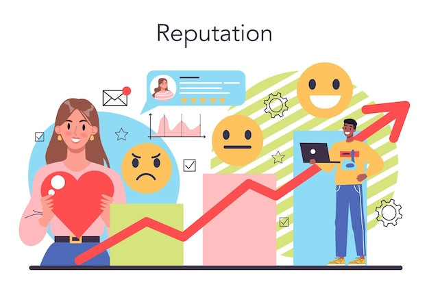
10 Mistakes to Avoid When Selecting Your Estage Template can make or break your website’s effectiveness. The right template supports your brand, guides your visitors, and drives conversions. But the wrong choice can slow down your site, confuse your audience, and hold back your growth.
Estage offers dozens of templates, each with unique strengths and features. Picking the perfect one requires more than just good looks. You need a strategy that aligns design with function, especially if you're a coach, agency, or course creator looking to maximize impact.
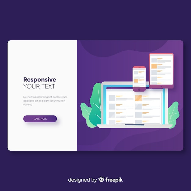
Ignoring Mobile Responsiveness and Load Speed

Many users make the mistake of choosing a template that looks great on desktop but performs poorly on mobile. With over half of web traffic coming from mobile devices, a site that doesn't adapt well to smaller screens will instantly lose credibility and engagement. Elements like overlapping text, cut-off buttons, or slow-loading banners can turn visitors away before they even read your headline.
Estage templates vary in how they handle responsiveness, so it’s important to test each option on different devices. For example, a template designed for portfolio pages might look sleek on a laptop but stretch awkwardly on phones, hiding important content below the fold. Load speed also plays a huge role—templates with large background videos or multiple animations can drag down performance, especially for users with slower internet connections.
Use Estage’s preview mode and performance insights to spot potential issues before going live. Lightweight, clean templates tend to load faster and maintain clarity across all screen sizes. A fast, responsive design not only improves user experience but also contributes to better search engine rankings.
Overlooking the Importance of Call-to-Action Placement

Call-to-action (CTA) placement can significantly affect how well your Estage site converts visitors into leads or customers. A common mistake is choosing a template that buries CTAs too far down the page or spreads them inconsistently. If users have to scroll too much or search for the next step, they’re more likely to leave without taking action.
Strong templates place CTAs where user attention is highest—typically near the top of the page, after key sections, or in sticky headers. For example, a coaching template with a “Book Your Free Call” button right under the headline performs better than one that hides the same CTA beneath several paragraphs of content. Visual cues like contrast, spacing, and repetition also help guide users naturally toward your desired outcome.
When reviewing Estage templates, look for designs that balance content with clear, accessible CTAs. Some templates offer built-in sections with prominent buttons, while others may require you to manually add them. Make sure the structure supports your specific goals, whether that’s collecting emails, scheduling calls, or selling a product.
Selecting a Design That Doesn’t Match Your Brand Aesthetic

Choosing a template that clashes with your brand’s look and feel can confuse visitors and weaken your message. If your brand is clean, minimal, and modern, using a template filled with bold colors and playful fonts will feel disjointed. Consistency across your visuals, copy, and design builds trust and recognition over time.
Estage offers templates suited for different tones—some are sleek and professional, others are bright and expressive. For instance, a course creator targeting busy professionals might benefit from a polished layout with muted tones and sharp typography, while a wellness coach might lean toward soft colors and open spacing. Skipping this alignment can make your site feel generic or off-brand.
Take time to compare your current branding assets—like your logo, font choices, and imagery—with the design style of each template. Templates that require fewer tweaks to match your brand will save time and maintain design integrity. The closer the visual style is to your existing identity, the more cohesive and memorable your site will feel.
Using a Template with Poor Navigation Structure
A well-structured navigation menu is essential for guiding visitors through your site and helping them find what they need quickly. Choosing a template with confusing or limited navigation can frustrate users and increase bounce rates. Templates that hide important pages or rely on overly complex menus often fail to convert traffic effectively.
- Avoid templates that lack a visible top menu or use hard-to-click dropdowns.
- Choose templates that let you prioritize high-value pages like services or booking.
- Make sure mobile navigation mirrors the desktop experience clearly.
- Look for templates with built-in breadcrumb trails or anchor links for longer pages.
- Test how easy it is to get from the homepage to any key page in under three clicks.
Clear navigation improves user experience and boosts SEO by helping search engines crawl your content. The best Estage templates allow you to structure your site logically while keeping everything accessible. Whether you’re showcasing offers, publishing blogs, or promoting courses, visitors should never feel lost.
Not Considering the Type of Content You’ll Publish

One of the biggest mistakes users make is choosing a template without thinking about the kind of content they’ll be publishing regularly. Your template should support and enhance your content strategy, not limit it. Whether you're focused on videos, long-form blog posts, or showcasing products, the layout needs to fit your content needs from day one.
- Templates designed for video creators should highlight embedded media above the fold.
- Bloggers need clean, readable layouts with strong typography and easy-to-navigate archives.
- Coaches or course creators benefit from templates with testimonial blocks and scheduling sections.
- Ecommerce or affiliate marketers should choose templates with flexible product grids and comparison sections.
- Content-heavy brands need templates with organized sections for guides, FAQs, and resource links.
Choosing a template built for your content type helps reduce design work and improves your site's usability. The more naturally your content fits into the layout, the easier it becomes to maintain a consistent publishing flow. A mismatch here can result in awkward formatting, low engagement, and wasted potential.
Skipping Template Testing on Different Devices
It’s easy to assume a template that looks great on your laptop will perform just as well on a phone or tablet. But failing to test your Estage template across multiple devices can lead to broken layouts, overlapping text, and poor user experience. Many templates respond differently depending on screen size, especially when custom sections or third-party widgets are involved.
For example, a button that appears perfectly aligned on desktop might be pushed off-screen on mobile, making it impossible to click. Similarly, columns that display side-by-side on a large monitor might stack awkwardly on smaller screens if not configured correctly. These small layout issues add friction that can quietly hurt engagement and conversions.
Use your browser's device preview or test directly on your own smartphone, tablet, and desktop. Make sure key elements like CTAs, forms, menus, and headings adjust properly without crowding or disappearing. Templates that are flexible and mobile-tested will ensure a smoother experience for every visitor, no matter how they access your site.
Failing to Customize the Template Properly
Selecting a solid Estage template is only the first step. If you don’t take time to personalize the design, it can feel like a generic, out-of-the-box site. Visitors may recognize the default layout from other users, which weakens your brand’s uniqueness and credibility.
Customization doesn’t have to mean major design changes. Even small adjustments—like swapping out stock images, updating font styles, or tailoring section headlines—can make a big difference. For example, replacing placeholder testimonials with real client quotes helps build authenticity and trust.
Estage gives you tools to tweak colors, layout spacing, and content blocks to reflect your brand more clearly. Templates are built to be flexible, but they only shine when adapted to match your specific goals and messaging. A well-customized template looks intentional, not just functional.
Choosing Style Over Functionality

It’s tempting to pick a flashy template because it looks impressive at first glance. But if the layout isn’t built to support your goals, it can become a liability. A stunning design that lacks clear structure, strong CTAs, or conversion-focused elements won’t help grow your business.
For example, a template with complex animations and oversized graphics might look visually appealing but could slow down load times and distract users from your message. On the other hand, a simpler layout with clearly defined sections, strategic buttons, and straightforward navigation will typically perform better—even if it looks less exciting.
The most effective Estage templates strike a balance between aesthetics and usability. Look for ones that guide the user journey clearly and put important actions front and center. When function supports form, your website not only looks great but also delivers real results.
Using Outdated or Non-Optimized Templates

Templates that haven’t been updated or optimized for current web standards can create issues for performance, security, and user experience. Even if a template looks nice on the surface, it may be missing critical behind-the-scenes improvements that support faster load times and better search visibility. Estage regularly adds new templates with fresh design principles, so sticking with older options can limit your growth potential.
- Older templates may lack mobile optimization or adaptive scaling.
- They often include outdated font styles or deprecated design elements.
- SEO best practices like structured headings and image compression might be missing.
- Non-optimized templates can slow down page speed and increase bounce rates.
- They might not integrate smoothly with modern Estage features like dynamic blocks or automation.
Keeping your site updated with modern, well-maintained templates helps ensure a smooth experience across devices and browsers. If your current template is showing signs of age or limitations, consider migrating to a newer option that offers better design flexibility and performance. Staying current keeps your site competitive and aligned with user expectations.
Not Checking for Built-In Conversion Features

A great-looking template is not enough if it lacks the tools to convert visitors into leads or customers. Many Estage templates are designed with built-in conversion features like opt-in forms, booking sections, countdown timers, or testimonials. Skipping over these details during template selection can force you to manually add or build critical elements later on.
For example, if your goal is to grow an email list, you’ll want a template with clearly placed opt-in blocks and integrations that support your email platform. If you offer coaching or consulting, templates with embedded scheduling tools or client intake forms will save time and streamline the user journey. Without these, your funnel may feel disjointed or incomplete.
Review each template’s default sections and preview how they guide users toward taking action. Look for layouts that encourage engagement without overwhelming the visitor. Templates built with conversion in mind will help you reach your goals faster with fewer tweaks.
Overloading the Template with Visual Clutter
Trying to showcase everything at once can quickly overwhelm visitors and reduce clarity. Some users pack templates with too many sections, graphics, or animations without a clear purpose. This can lead to cognitive overload, slow loading times, and a confusing user experience.
- Avoid using more than one or two font styles to maintain visual consistency.
- Limit the number of bright colors or animated elements on a single page.
- Keep sections focused by sticking to one message or goal per block.
- Use whitespace strategically to break up content and avoid crowding.
- Remove unnecessary pop-ups or banners that compete for attention.
Clean, focused layouts guide the eye and improve engagement by making information easier to digest. Estage templates are flexible, but it’s important to use that flexibility with intention. Prioritize clarity and purpose over decoration to keep your message sharp and effective.
Ignoring SEO-Friendly Design Elements

Selecting a template without considering its impact on SEO can hurt your site’s visibility in search engines. Some Estage templates may look appealing but lack foundational SEO features like proper heading structures, image alt attributes, or optimized loading behavior. These elements play a key role in how search engines understand and rank your content.
For example, a template that uses multiple H1 tags or skips H2 tags can confuse search engines and lower your rankings. Similarly, if images don’t have alt text fields or lazy loading enabled, your page may load slower and miss out on valuable image search traffic. Clean HTML structure and fast-loading elements are also critical for improving page experience scores.
Before finalizing a template, review how it handles metadata, headings, and mobile performance. Check if it supports schema markup or integrates smoothly with Estage's SEO tools. Templates designed with SEO in mind will give your content a stronger foundation and help you compete in search results.
Neglecting Your Audience’s Preferences and Behavior
Choosing a template based only on what you personally like can lead to a disconnect with your target audience. Your website should reflect the expectations, habits, and preferences of the people you want to attract. Ignoring this can result in low engagement and poor conversion rates.
For instance, if your audience is made up of busy professionals, they may prefer a streamlined, no-fluff layout with clear CTAs and easy navigation. If you're targeting creatives or lifestyle enthusiasts, a more visual and expressive design might be more effective. The key is selecting a template that feels natural and intuitive to your visitors.
Use analytics or audience feedback to understand what your users respond to. Estage makes it easy to preview different templates, so take time to test what feels right from your customer’s perspective. Aligning design with user behavior improves both the experience and the results.
Not Planning for Scalability and Future Edits

Some templates look perfect when you’re starting out but become limiting as your business grows. If you don’t choose a design that can scale with your content, services, or features, you’ll likely end up rebuilding your site sooner than expected. Planning for flexibility from the beginning saves time and effort in the long run.
- Pick templates that allow you to easily add new sections or pages without redesigning everything.
- Choose layouts that support blogs, lead magnets, or product pages—even if you don’t need them yet.
- Look for templates with reusable blocks and global settings to simplify future edits.
- Avoid fixed designs that don’t adapt well to expanded navigation or content volume.
- Make sure the template works well with Estage’s automation and CRM tools if you plan to scale.
Scalable templates give you room to grow without constant rework. Whether you're adding new offers, starting a podcast, or launching a membership, having a flexible design foundation helps keep your momentum strong. A good template should evolve with you, not hold you back.